Monday, September 28, 2009

Harley Davidson: Art of Rebellion show, Oct. 17th, NYC

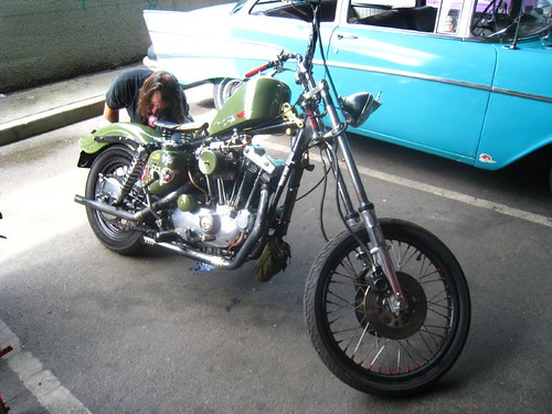
Coming to the La. Venue in Manhattan is Harley-Davidson organized Art of Rebellion, another round of posters and custom painted gas tanks from several of the best gigposter artists today to present their take on the theme of "rebellion". All the artists involved are masters of their craft, but I have a special place in my heart for a few of them I know more personally (Chantry, Kozik, Tara McPherson and Brian Ewing). I always like to see up close and personal what people I like have been working on.


The Art of Rebellion is a one-night only event taking place on October 17, 2009 at LA Venue in the Chelsea arts district of New York City. Each artist will have an original, one-of-a-kind piece created on an Iron 883 tank, as well as signature posters from their collection available for purchase.

La. Venue is located at 608 West 28th Street (Between 11th & 12th Ave, New York, NY 10001. There will be DJs, free drinks and the event itself is 100% FREE. Doesn't get better than that!


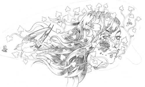
A preview of Kozik's painted bike parts.


Dirty Donny's contribution.

This is also going on the same week as the Royal Flush Festival, an insane four day stretch of hard rock art, music and film events, coinciding with the release of the latest issue of Royal Flush Magazine, put together by my buddy Josh Bernstein and a handful of his metal head SVA graduate friends. This new issue is also special because my most handsome and talented man-friend Mark was asked to participate and illustrate a section.

So I'll be killing myself from October 14th - 19th, trying to survive going to work every morning after having been up rocking the fuck out of every art show, rock show and party to be had. I suspect it will all be worth it. Join me...jerks!

Saturday, September 19, 2009

Saturday Surfin'

My brain is a little foggy from the first late night out I've had in a very long time (I must be getting old), and I don't know if it can spit out a well constructed, cohesive and entertaining post for you. So instead, here's a list of all the tabs I have open in my Firefox browser window. Soo much stuff to learn, so many millions of words to read...it's a little overwhelming sometimes, this internet junk.

The Jalopy Journal, H.A.M.B. messageboard - reading about this year's Hot Rod Hoedown that happened in Bensalem, PA last weekend. (An aside: somebody on the board PM'ed me to tell me literally, this one sentance, "I like your website." I'm a success! Huzzah! Somebody give me my Miss Popularity sash already, goddamnit.) The always reliable Mr. Ralphy, who likes to take and upload his photos as fast as I do to Flickr, has a bunch of shots from the show.


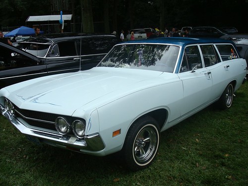
Custom Torino Wagon with awesome metal flake paint job, via mister RALPHY on Flickr.

I've noticed a lot of these late 60's muscle mom-wagons popping up at car shows lately, which I think is funny. Maybe it's a weird gearhead version of an Oedipal complex. Something about hauling ass and layin' rubber in a loud, sexy, powerful, vibrating, souped up version of the car your mom shuttled you around in as a child sounds like an issue you need to discuss with your therapist or maybe your cat, after polishing off a handle of whiskey. This one, a '71 Ford Torino Wagon (or so I think, anyway...I first totally misclassified it as a custom '68 Pontiac Tempest wagon), had a pretty sick flake-paint job on the hood.


Dice Magazine Blog
My motorcycle building buddy Peter mentioned to me that he thought he would have seen me last night at the Dice Magazine issue release party at Matchless in Greenpoint, Brooklyn (a former auto parts shop turned booze slinging bar, catering to the greasemonkey, punk rock, metal crowd). Instead, having not known anything about said release party, I was out until 3am elsewhere in the city - and then rode my bike all the way back to my hood near Coney Island.


Cover for issue 16 brought to you by Coop!

Having missed what sounded like a good party, I went back to catch up on the Dice blog and see what else is going on. HOWEVER, I then realized they basically have two blogs, one on their site that is just NEWS (where the party info was) and the other one I am reading, more 'lifestyle section' than news...which confused me. But whatever - they can have a million blogs for all I care. I'll still forget to read them, but not because they aren't awesome, but because I'm an idiot. And that means I'll continue to miss out on all the good parties. Damn! I need a personal assistant.


Panheads Place - The History of the Knucklehead Engine
There's nothing I love more than when some nerdlinger in this universe who is obsessed with some particular item or pasttime or person has something interesting to say or a wealth of information I'd like to access and makes it all available on a website of their creation. I especially like it when these websites are really poorly designed and filled with animated GIFs and you have to close a pop up window at least once a minute. IT'S AWESOME! MOST FAVORITE THING EVER OMFG!


HOLY SHIT IT'S PANHEADS PLACE WELCOME BIKERS! LOOK there's an eagle!! Microsoft Paint RULEZ!

Despite it's total lack of graphic sensibilities, this website about the history of the various original models of Harley engines over the years pretty much covers everything. Nerdlinger starts his history of the knucklehead enging by talking about the standard three drops of oil for every five seconds of runtime the old Harley flatheads had. That right there is something I didn't know, so I can't dis the guy for teaching me something. SOAR WITH US!

Also, check out this sick knucklehead custom chopper from the Rumblers show back at the end of August, and another that's a shovelhead, which I have video of riding away from that spot (albeit sideways video). I swear, those Rumblers photos are coming soon...if you haven't already found them on Flickr.


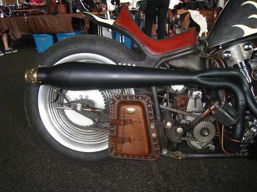
The "Speed Fetus" has a luscious ass...just look at that rear end action!


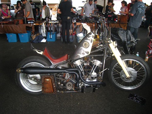
Shovelhead custom chopper in Brooklyn.


The Dart Project
A story about a boy, a car (stock 1966 Dodge Dart GT), and a transformation from mundane Mopar to divine dragster.


I remembered the Frenchy who runs this website - he's an artist and pinstriper who goes by the moniker Empire32 and his Kustom-o-graphics. I'm pretty sure back in the early youth of thegreasergarage.com, we were linking to that guy's work and raving about it even then. So I guess posting about his Dart project somehow completes the circle of internet life.


Thesaurus.com - so I could look up a snyonym for the word "boring" that begin with the letter "m". (Told you I was braindead.)


Flickr Upload window - I'm desperately trying to upload a video from the Rumblers show I took, but it keeps getting 99.5% complete and then never actually finishing or showing up in my photostream. As soon as that changes, you'll get to see the video right here. Impatience is a major imperfection of mine.

*UPDATE* It finally uploaded! Burn it up!!


...and here's the rubber carnage left behind.


Coop's Flickr Photostream
...because who doesn't like a little high quality dirty art fetish photography on a Saturday morning? I'll take my coffee with a dash of milk and a little bit of nip.


Kumimonster & Ulorin Vex and a pair of old schwinn fastbacks - photo by Coop


...yep. I think it's shapin' up to be a damn good day.

Thursday, September 17, 2009

Typography Porn :: Hot Rod and Retro Fonts

If there's anything that's a true mark of a real graphic designer, it's an obsession with type. My friends think I'm insane when I blurt out the names of fonts on billboards while cruising down the highway or have an argument with my boyfriend on the subway over whether or not the guy next to us has a newspaper with the headlines written in Cooper Black (HIM:"No, that font has squared off edges on the serifs and I swear Cooper Black was totally round." ME:"Those ARE rounded serifs...are you blind?? There's NO mistaking Cooper Black.").

As you might imagine, I swoon hard over a damn fine retro font, and aren't you lucky...I've got a list of the best of the best font foundries and websites where can get your fonty fetish fix.


#1: Font Diner
These guys are at the top of my list of places to go if you need solid, well designed vintage inspired fonts that won't empty out your wallet. We're talking like, 12 font sets for a measly thirty clams ($30...if you can't dig my jive). I'm particularly fond of their

"Volcano" font by Font Diner

I've purchased, at one point or another, almost all their font sets and have never been disappointed. Full character sets, an occasional cheeky dingbat...I couldn't recommend them more! (Needless to say my college design projects oh so long ago were rife with glyphage from Fontdiner.com.)


#2: House Industries
House Industries is the granddaddy of retro-styled fonts, meticulously crafted and with a pricetag to match. You might know these folks as the ones who developed the Coop and Ratfink font sets, both of which came in limited edition packaging (for true font nerdlingers).


If you've got some corporate funding for your typography desires or are just so damn recession-proof you can shell out $300 for any badass font family that catches your eye, I suggest you stop at House and show them your patronage.


"Ed Benguiat" inspired font from House Industries

Also, here's a cool interview with the House Industries renegade staff of type designers done by the folks over at Seeds and Fruit, an art and design blog.


#3: Sudtipos
Representing our type-obsessed friends in Argentina, this Buenos Aries based company has some lovely retro fonts within their collection.


"Kewlscript" by Sudtipos


All of the fonts on their site are sold through Veer.com and when you get tired of typing sweet musings in sultry Sudtipos fonts in la lengua del amorthe, you can head on over and check out their design blog...si usted habla espaƱol. (I don't, but Babelfish does.)


#4: Prop-a-ganda
Got something you want to write in your loudest Fascist Dictator type voice? ACHTUNG!! SCHAUEN SIE NICHT WEITER! (I'm gettin' all multilingual up on yer asses! German language appears courtesy of my six years of german studies, and a little vocab help from Babelfish.) Prop-a-ganda, where fonts are, in their own words:
    "inspired by lettering on retro propaganda posters
    retro advertising posters
    retro packages all the world over."

"Tekov" font by PAG

Mostly all-caps, stencil-esque fonts (who has time for lowercase letters when there are infidels to smote!) and at only $20 a pop you'll find yourself scooping them up so fast you'd think you'd been brainwashed.


#5: Tack-O-Rama (a collection of retro fonts)
If I can't find what I need from the aforementioned sites, that's when I turn to Tack-O-Rama, a retro/pre-war/alternative (ska, rockabilly, punk)/etc. curated collection of fonts, clipart, and stock photography that will fulfill any and all of your vintage graphic needs.


Much of their collection is also FREE, which is a godsend, again, in this cash-strapped age we live in. But you should consider throwing them some cash or a donation where you can, because the sites creators clearly spent a lot of time scouring the web for all that good stuff that I always forget to bookmark, and which subsequently disappears into the virtual abyss. Now here it all is, sorted and together in one place.

And lastly, in a stock-image related note, I have to give a shout out to the rad folks over at CSA Images (a favorite of my poster designing peeps at Gigposters.com), who specialize in sublimely subversive graphics for even the oddest of your design projects.


A sample image from CSA's "Printstock" gallery.

They've got all kinds of images of old plastic toys, bad mod paintings, vintage clip art, patterns, all artfully composed and ready to be turned into your next Detroit Cobras poster...or whatever it is you're working on that requires tongue-in-cheek, throwback to the past, somewhat distressed artwork.